Nut Bite: Brand & Packaging
CLIENT:
NUT BITE
SINGAPORE
Packaging design & visual identity for a nut-based healthy snack brand.
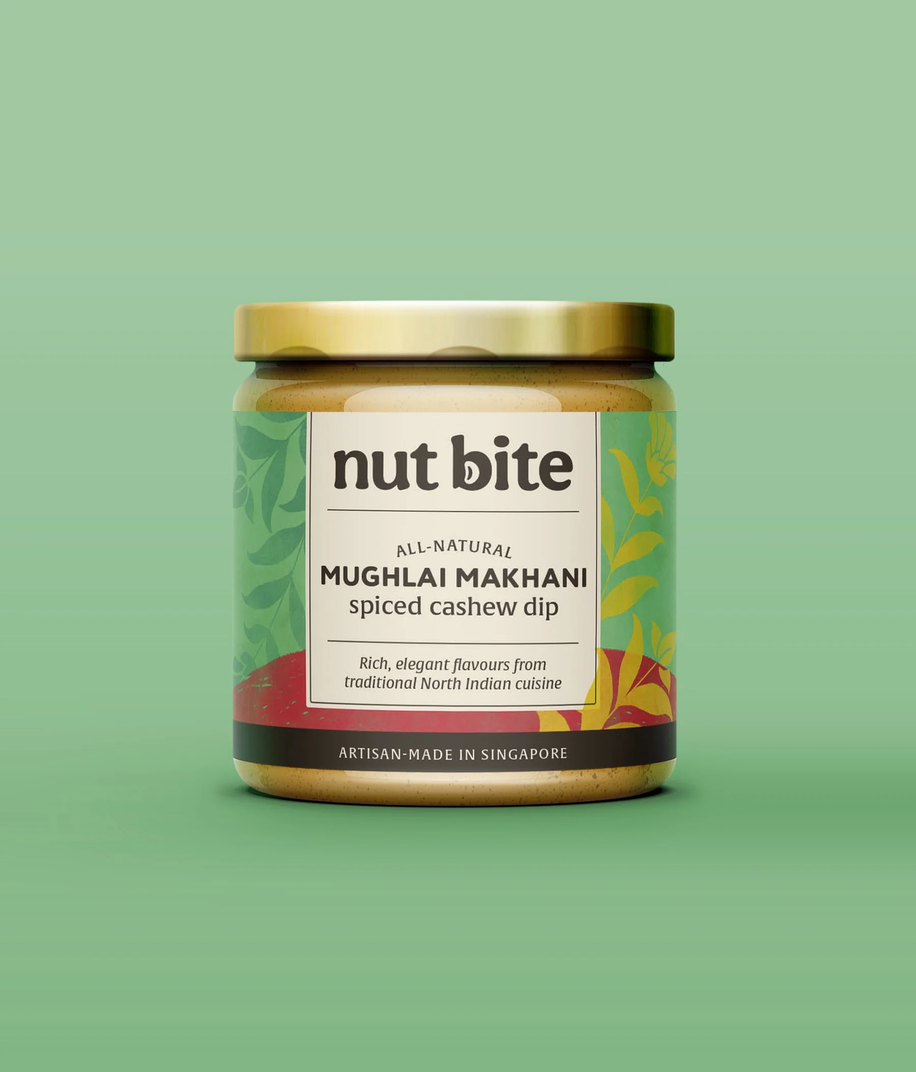
The client desired a joyful and colorful look for their 22-product range. A unifying brand yellow allows the colors to have their fun while keeping the design cohesive and clean.
Label designs of region-specific flavors echo their origin: for example, the Portuguese Rooster of Barcelo and 16th-century Mughal florals.